Front Facade - Exploring Contrast
- Dec 22, 2025
- 1 min read
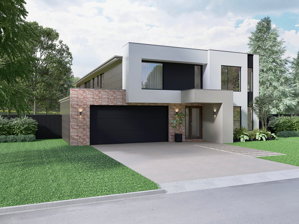
This project was all about clarity.
The clients loved the idea of using two different bricks on the front facade, but struggled to visualise how the combination would read once built. On top of that, they were torn between two front entry colour options - a clean white or a warmer grey tone.
Rather than guessing, we explored both options visually.
By placing the materials together in a realistic render, the contrast between the bricks could be assessed properly, how they balance each other, where the eye is drawn, and how the entry colour subtly shifts the overall feel of the home. What felt uncertain on paper became calm and resolved once seen in context.
This is where 3D rendering really earns its place in the design process. It allows decisions to be made with confidence, not imagination alone ensuring the finished facade feels intentional, balanced, and quietly confident from the street.
Sometimes it’s not about changing the design - just seeing it clearly.